Alana008's Blog

Just another WordPress.com site

FINAL PROJECT JOURNAL December 6, 2010

Filed under: FINAL PROJECT! — AlanaR @ 3:45 pm

Alana Rudkin
Visual Literacy
Final Project Journal
12.6.2010


When people think of the District of Columbia, images of the White House, Washington Monument, Capitol and countless museums often come to mind. Since DC is our nation’s capitol, people often equate it (rightfully so) with politics and governmental agencies. However, what many people do not think about when they think of DC is its vibrant and unique night life in countless neighborhoods throughout the District. The general lack of knowledge about DC’s night life is what inspired my project.  The purpose of my photo essay is to open people’s eyes up this relatively under-explored aspect of DC. By showing the diverse people, venues and cultures in the three neighborhoods I photographed, I hope to inspire people to go out and experience DC’s night life for themselves.


My original plan was to photograph Dupont Circle, Adams Morgan and U-Street, however in my final project I substituted U-Street with Georgetown to capture more diversity in the neighborhoods. As stated above, my goal was to capture the unique characteristics of the night life scene in these three neighborhoods.  The first place I photographed was Adams Morgan, and after the shoot I was slightly discouraged and frustrated. I did not feel like I was able to truly capture what made Adams Morgan different from any other neighborhood. I had a lot of pictures of people and the street, but there was no way to distinguish that these people and this street were in Adams Morgan! I was stressed out and tempted to change my final project all together. However, after I met with my professor she picked out my two strongest photographs from Adams Morgan and told me to focus on capturing images that somehow convey which neighborhood I was photographing. For example capturing a street sign or a venue with the neighborhoods name in it.  Once I established what neighborhood I was in, then I could capture the people within that neighborhood.  After that meeting I was significantly less stressed out and felt confident that I could complete my final project.


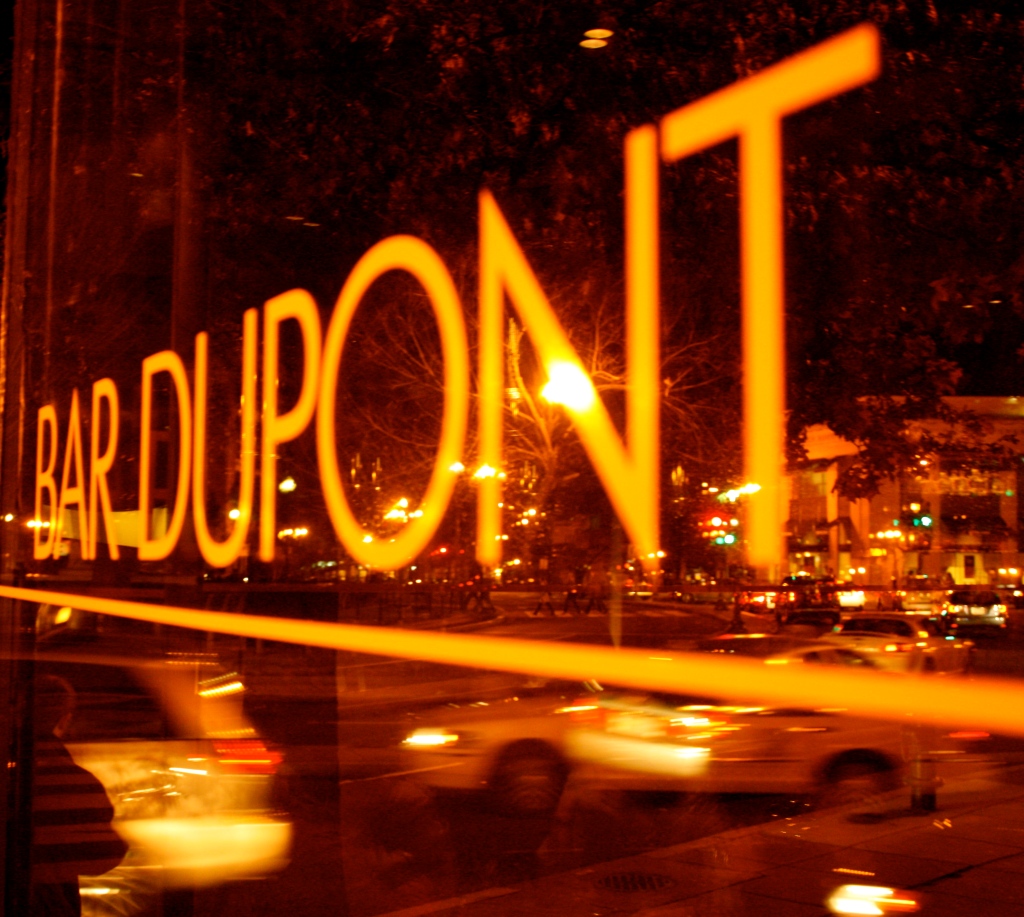
My project was shot over a two day period. I photographed Adams Morgan on Saturday November 29th from 11pm to 12:30am, and then I photographed Dupont and Georgetown Saturday December 4th from 11pm to 3:00am.  To prepare for my project, I made a list of the places in each neighborhood that I considered to be the most popular and well known. I figured that if I photographed popular places then people would just know what neighborhood I was photographing. Well, this didn’t exactly work out as I had planned.  Shortly after I began photographing, I came to the realization that not everyone necessarily goes out in these neighborhoods and therefore would not know the “popular” places. I remembered the advice I got from my professor about photographing places that contain the name of the area first and then capturing the people within that neighborhood. Thus, at least one photograph from each neighborhood contains the name of the neighborhood itself. I think this was the best way to ensure that everyone knew which neighborhoods were photographed.


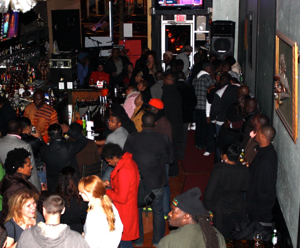
I also prepared for my final project by looking at photographs by Robert Doisneau, a famous 2oth century French photographer who used street photography to capture the daily life in the city.  His photographs illustrated the culture, atmosphere and people of France.  I wanted to emulate his style of being able to capture people in the moment, when they have no idea they’re being photographed.  I think I did an okay job capturing people in the moment, however it is something I would like to improve on if I were to do this project again.  My vision of photographing people pouring out of night clubs at 3am or going crazy on the dance floor didn’t exactly come true.  I was told in a number of places that I wasn’t allowed to photograph without a contract with the venue, which was annoying, but its okay. I was still able to sneak some shots in at the Reef in Adams Morgan before I was asked to leave because I didn’t have a contract! I have never actually been asked to leave a bar before, so that was a new and fun experience.


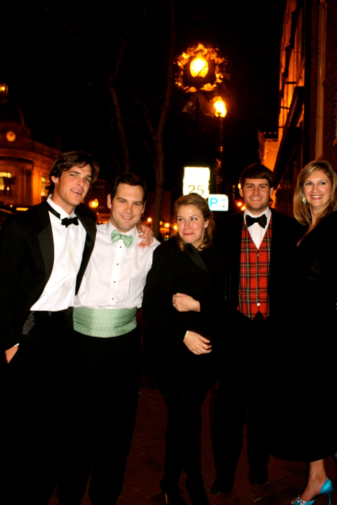
Another problem I encountered was my own discomfort with photographing people I didn’t know. I felt awkward and like people were wondering why I was photographing them.  This had a negative impact on my photographs, specifically in Adams Morgan, the first place I shot.  I kept trying to hide my camera to photograph people or I would quickly take a photo without focusing the camera and then the picture would be blurry. However, the more I photographed the more comfortable I became. It was cool! By the end of the second night of my shoot I felt like a real photographer. People even stopped and asked me to take their photograph. That is how I got the picture of the people dressed up in Georgetown. I really enjoyed going out from the prospective of a photographer!


Over all, I am satisfied with the final product of my photo essay on DC night life. I was able to complete my objective of visually conveying the diverse people and places in three different neighborhood’s night life. My final project is not that much different that my original idea with the exception of photographing Georgetown instead of U-Street. It worked out really well that I photographed Adams Morgan one week then met with my professor then photographed Dupont and Georgetown the following week because I was able to correct the mistake I made in Adams Morgan when I photographed the other two neighborhoods.  With the help of my professor, I was able to over come my fear and stress of not being able to distinguish the neighborhoods in my photographs.  Although I was initially timid about photographing people without them knowing, I over came this obstacle by continuing to photograph. The more I photographed, the more natural it felt.


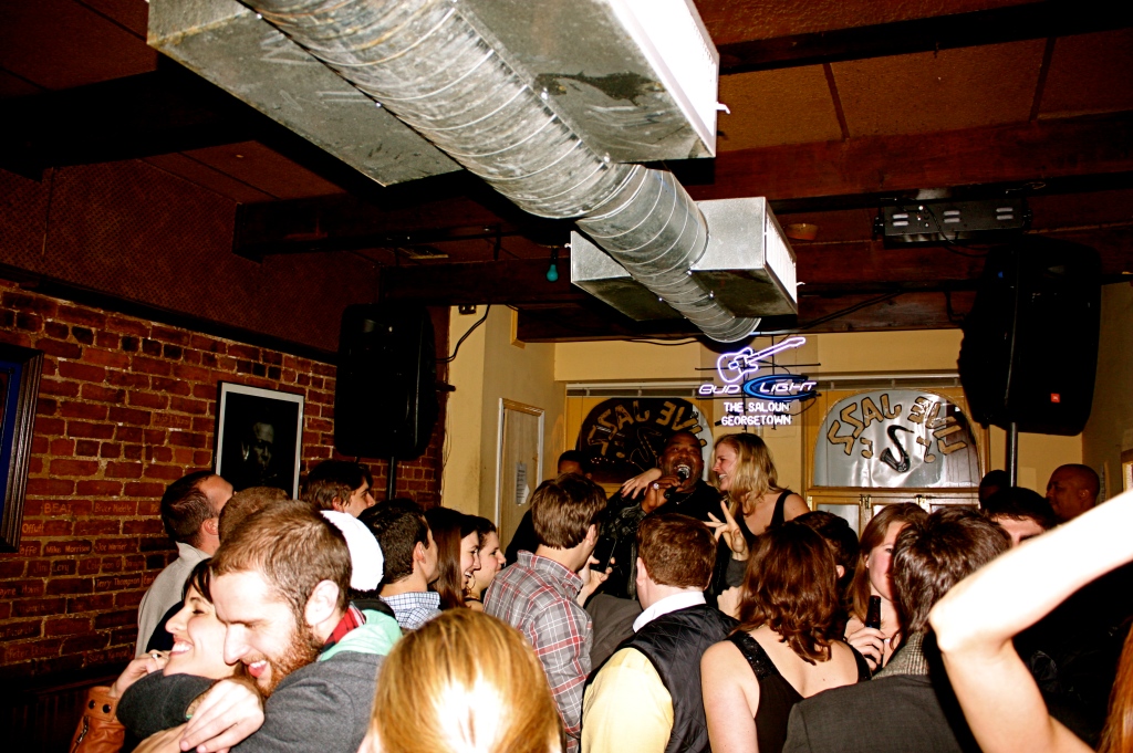
I am most proud of my photograph of Bar Dupont and the Georgetown Saloon. I am disappointed that I was not able to capture more candied photographs of people in bars and night clubs like the one in the Georgetown Saloon. If I were to do this project again I would try to focus more on the people.  However I do think that I have a nice balance of people and places in the seven photographs I chose for my final project.  This project has taught me that a truly good photograph does not come with one click of the camera.  I learned to plan the angel and frame of my shots, and to take as LOTS of photographs because it is better to have too many photographs than not enough. Now that I am more comfortable with the camera, I would definitely do this project again! I truly enjoyed going out and photographing DC’s night life as opposed to being immersed in the scene itself.
 

DC After Hours: A Comparative Photo Essay of Three Neighborhood’s Unique Night Life

Filed under: FINAL PROJECT! — AlanaR @ 6:25 am

ADAMS MORGAN:

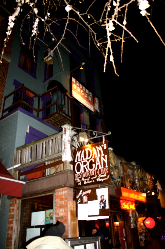
“MADAM’S ORGAN IN ADAMS MORGAN.”

Camera Used: Cannon. Width: 2,065 pixels. Height: 3,088 pixels. Shutter Speed: 1/60. Aperture f/4.0. Focal Length: 18mm. ISO Speed: 400.


“BARS AT THE BOTTOM OF 18TH STREET.”

Camera Used: Cannon. Width: 3,088 pixels. Height: 2,056 pixels. Shutter Speed: 1/60. Aperture: f/3.5. Focal Length: 18mm. ISO Speed: 400.


“REGGAE NIGHT AT THE REEF IN ADAMS MORGAN.”

Camera Used: Cannon. Width: 2,472 pixels. Height: 2,047 pixels. Shutter Speed: 1/60. Aperture: f/3.5. Focal Length: 23mm. ISO Speed: 400.


Dupont Circle:


“REFLECTIONS”

Camera Used: Cannon. Width: 3,178  pixels. Height: 2,848 pixels. Shutter Speed: 1/4. Aperture: f/5.0. Focal Length: 40mm. ISO Speed: 800.


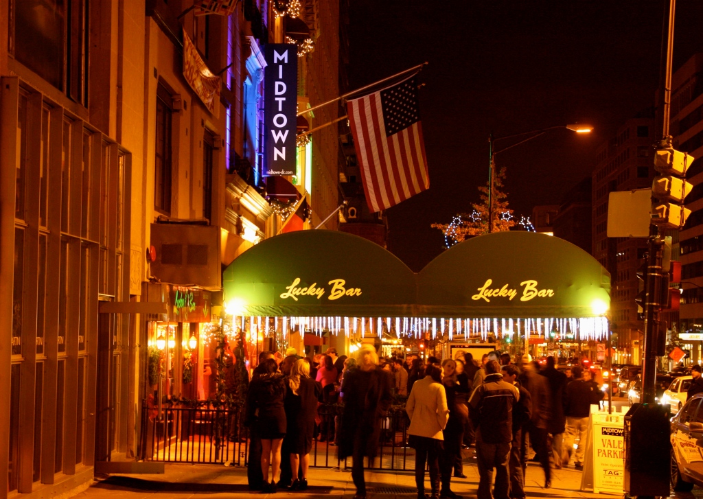
“MIDTOWN AT MIDNIGHT”

Camera Used: Cannon. Width: 4,006 pixels. Height: 2,848 pixels. Shutter Speed: 1/4. Aperture: f/4.0. Focal Length: 23mm. ISO Speed: 400


GEORGETOWN:

“LIVE JAZZ MUSIC AT THE GEORGETOWN SALOON”

Camera Used: Cannon. Width: 3,088 pixels. Height: 2,056. Shutter Speed: 1/60. Aperture: f/3.5. Focal Length: 18mm. ISO Speed: 400.


“A NIGHT ON THE TOWN”

Camera Used: Cannon. Width: 2,056 pixels. Height: 3,088 pixels. Shutter Speed: 1/60. Aperture: f/4.0. Focal Length: 23mm. ISO Speed: 400.


“M Street Lit Up”

Camera Used: Cannon. Width: 4,272 pixels. Height: 2,056 pixels. Shutter Speed: 1/60. Aperture: f/4.0. Focal Length: 20mm. ISO Speed: 800.


STORY BACKGROUND:

The purpose of my photo essay, “DC After Hours: A Comparative Photo Essay of Three Neighborhood’s Unique Night Life,” is to open people’s eyes up to a relatively under explored aspect of DC: its vibrant night life.  When people think of the District of Columbia, images of the White House, Washington Monument, Capitol and countless museums often come to mind. Since DC is our nation’s capitol, people often equate it (rightfully so) with politics and governmental agencies. However, what many people do not think about when they think of DC is its vibrant and unique night life scene in countless neighborhoods throughout the District. My photo essay reveals that although DC is relatively small compared to most metropolitan cities, the diverse people, neighborhoods and culture makes DC seem larger and more cosmopolitan.


To achieve my stated objective, I chose to photograph Adams Morgan, Dupont Circle and Georgetown. I photographed Adams Morgan on Saturday November 29th from 11pm to 12:30am, and then I photographed Dupont and Georgetown the following week on Saturday December 4th from 11pm to 3:00am. I chose to photograph these neighborhoods late on Saturday night because based on my personal experience this is the most popular time for people to go out.


After comparing the photographs from the three neighborhoods I found that Adams Morgan had the most diversity in terms of the people who go out there. While Dupont Circle and Georgetown were predominately populated by Caucasian people, Adams Morgan contained a larger population of African Americans and foreigners. In addition, Adams Morgan had many more unique bars and store fronts characterized by large neon lights and decorative signs, than both Georgetown and Dupont. I believe this is due in part to the fact that many of the venues in Georgetown and Dupont serve as restaurants during the day, while although some places in Adams Morgan are restaurants as well the majority of places serve solely as bars.


My project was inspired by the work of Robert Doisneau, a famous 2oth century French photographer who used street photography to capture the daily life in the city.  His photographs illustrated the culture, atmosphere and people of France.  I wanted to emulate his style of being able to capture people in the moment, when they have no idea they’re being photographed.  I could have done a better job at capturing candid shots of people. I think my inability to truly emulate Doisneau’s work was due to my own discomfort with photographing people I didn’t know. I felt awkward and like people were wondering why I was photographing them.  Although I became more comfortable with this the more I photographed, I still think I could have done a better job.


Over all, I am satisfied with the final product of my photo essay, “DC After Hours: A Comparative Photo Essay of Three Neighborhood’s Unique Night Life.” I was able to complete my objective of visually conveying the diverse people and places in three different neighborhood’s night life. By showing the diverse people, venues and cultures in the three neighborhoods I photograph, I hoped it would inspire people to go out and experience DC’s night life for themselves.


Movie Poster for The Spaghetti Showdown November 22, 2010

Filed under: Film — AlanaR @ 3:20 am


The Spaghetti Showdown

Filed under: Film — AlanaR @ 3:18 am


Up Heartbreak Hill Film Critique November 14, 2010

Filed under: Film — AlanaR @ 3:38 am


Up Heartbreak Hill, directed and produced by Erica Scharf, chronicles the lives of three Native American teenagers living on a rundown Navajo reservation in New Mexico. The documentary follows the three teenagers (Tamara, Gabby and Thomas) as they finish their senior year in high school and struggle with the decision of what to do next.  Their decisions of weather or not to leave the reservation and go to college is complicated by their loyalty to their family and community on the reservation. Being the next generation to lead the Navajo Nation, one can imagine the decision to leave is not an easy one for these three students. Unfortunately, there is little hope for a successful future on the reservation due to lack of available jobs and a high rate of drug abuse in the community. In addition to the struggle of what to do after graduation, this film captures the struggles the three teenagers face with their families, academics, athletics and relationships.


I had no knowledge of contemporary Native American (specifically Navajo) life prior to seeing Up Heartbreak Hill.  To be completely honest, I was expecting to see three teenagers dressed in blue jeans and moccasins living in t-pees with thick native accents. I do not mean to sound ignorant, but when I heard “Navajo Nation Reservation,” that is what came to mind. When the film started I was very surprised to see three “American” looking teenagers, dressed in similar clothing to the clothing I wear, speaking clear English with no accent at all, and attending high school in an actual school building. I felt pretty foolish, to say the least, when I realized that Navajo teenagers weren’t that different from myself.


I think this movie is targeted at people just like me who have no sense of what life is like for the Navajos on their reservation in New Mexico. I believe the director created this documentary to illustrate that teenage struggles, family issues and the fear of leaving home are universal.  By the end of this film I realized that although I live on the other side of the country, in a significantly more developed and prosperous society than Tamara, Gabby and Thomas- I still have experienced the same issues and problems that they are currently struggling with.


There was one scene in the film that really intrigued and interested me. After Thomas has graduated, he and his family held a traditional Navajo celebration ritual. This ritual consisted of preparing a feast over a bonfire, chanting in the native Navajo language, drinking a lot and then sleeping in a huge t-pee they build. I liked how Scharf  incorporated the native coming-of-age rituals with contemporary teenage life on the reservation.


The overall filming style of Up Heartbreak Hill was simple. There were no special sound effects or unique camera angles. The majority of the camera angels were high and low angel with the occasional birds eye view of the reservation. I think Scharf used a simple filming style to make a statement to the audience that this is “real” and has not been enhanced by special effects or over-edited. I personally think the simple camera angels and lack of effects enhanced the film and made it message more salient.  I would recommend this film to my friends because there is a lot that one can learn about themselves by watching it. When the movie ended, I had so many emotions and thoughts spinning around.  I felt enlightened, ignorant, thankful that I don’t live on a reservation, ungrateful, appreciative, and at the same time- so close to Tamara, Gabby and Thomas. The film really opened my eyes up to a whole new world, yet one that was also more familiar than expected.  There is a lot people can learn from this film, so I would definitely recommend it.


FotoWeekDC Critique

Filed under: Photography — AlanaR @ 2:20 am

During FotoWeekDC 2010, I went to Gallery 31 at the Corcoran museum. This famous DC art museum was dubbed “FotoWeekCentral” since it hosted a variety of FotoWeekDC activities, launch parties, exhibitions, lectures, expert portfolio reviews and more throughout the week. When I got the museum and asked the security officer where the FotoWeek exhibit was and she pointed to a small room with double glass doors to the right of her.  The exhibit was called “Faculty Choice: New Work by Recent Corcoran Photography and Photojournalism Graduates.”  This exhibit was comprised of the work of recent graduates from the Corcoran College of Art and Design. The exhibits participants were chosen by the Photography Department faculty, and reflects the diversity and talent of the Corcoran graduates.


In this exhibit I was most impressed by a piece by Antonio McAfee titled Offering & Source of Femininity, created in 2009.


I was drawn to this work because it incorporates both photography and installation art, which made it unique to all of the other works in this exhibit. This photo is of a man or woman bending down, holding a handful of paint that is dripping out of their hands and “into” the pale of paint in front of the photo. The pale of paint it set on top of metal scraps with dried paint dripping out of the can and onto the metal. It is difficult to tell what time of day this photograph was taken because it was likely taken in a studio where the photographer could manipulate the lighting to achieve the exact effects they wanted.


The point of orientation of this photograph is on the hands as they are painted white and set in a darker/brown background. The artist uses the color white to emphasize the hands of the subject and to unite the photograph with the pale of pain that is also painted white.  Lighting plays an interesting role in this work as it makes the legs of the subject almost look like a shadow as opposed to their actual legs. The photographer was able to capture a lot of texture in this photograph as well. The wrinkles in hands capture the texture of the human body: soft yet firm.  The paint dripping out of the hands of the subject portrays a liquidly texture, while the paint can and surrounding material it sits on offers a metal, tin, solid texture.  Although it is hard to see in the photograph I took of this work, there is a white line of paint that drips from the hands of the subject to the bottom of the photograph, giving the impression that the paint is dripping from the hands into the paint can.  This line of paint serves an important purposes as it unites the photograph with the physical paint can in front of it. In addition, this line helps direct the viewer’s eyes through the work from the hands down to the paint can and back up to the hands again.


I believe the photographer is making a statement about the importance of giving back.  The hand of the subject are positioned in a way that represents offering, and the paint is dripping out of the hands which represents giving.  Perhaps this is a metaphor for those those who “have” must give back to those “in need.”  This message relates to my life because I have always tried to give back to those less fortunate than myself through volunteering at food banks, planing philanthropic events to benefit various organizations, and making monetary contributions.  The photographer created this piece in the wake of the economic crisis in our nation, with the rich getting richer and the poor getting poorer.  I believe the artist created this piece as a reminder to give back what and when you can to those who are less fortunate than yourself.

This piece communicates an important and valuable social message that many people could benefit from if they take the time to understand the statement the artist is making.  This piece is also valuable in the sense that it combines both photography and instillation art to create a unique masterpiece. Over all I commend this photographer and artist for stepping outside of the box and adding their own twist to photography, while also communicating an important social message.


The Breakfast Club Critique November 8, 2010

Filed under: Film — AlanaR @ 4:48 am


This is a poster for the movie The Breakfast Club directed by John Hughes. This film can best be described as an American teen drama. In this film, five high school students, all from different social circles, spend the afternoon together in detention.  By the end of detention, they all realize that although they may be in different “cliques” they are really not that different at all. They each experience similar insecurities, have relationship problems with their parents, and all fear making the same mistakes and the generation above them.  At the beginning of detention they were five strangers from different social groups, and by then end they were “the breakfast club.”


I think this poster accurately portrays the film. Based on the way each character is dressed and posing, the viewer can tell that they are from different social backgrounds. For example, the “jock” is wearing his letter jacket, the “rebel” has his leather glove on and has his fist clamped ready to punch someone, and the “quiet/shy girl” has her bangs covering most of her face and her arms pulled tightly into her chest in an almost uncomfortable nervous way.  The small tag line under the title of the movie reads, “four strangers with nothing in common, accept each other,” which is the overarching message and theme of the movie.  This poster sells the movie, without giving too much of the plot away.


In terms of design, the all white background of the poster makes the students and the red, bold title stand out more. The poster is visually appealing and well balanced. The bottom of the poster is dense with the students, yet the title is bold enough to balance out that density. Since this poster is relatively simple, the viewer’s eyes move through the composition in a dynamic, smooth-flowing way.  The emphasis of this poster is on the students themselves as they are centered and take up three-fourths of the poster. In addition, having all the students meshed together (as opposed to standing apart from each other) accurately portrays the movie, since it is about these students from different social circles breaking down stereotypes and coming together. While there aren’t many iconic signs in this poster, there a certainly symbols that the viewer likely interperpates based on their knowledge of those symbols and words within our society. For example, I knew the boy in the letterd-jacket was an athlete because lettered-jackets symbolize sports in our society.  Likewise, the leather glove the one boy is wearing symbolizes rebellion, fear and aggression.


Over all I think this poster does a good job at portraying the message behind this movie, without giving too much of the plot away. The poster is simplistic in nature, well balanced, and combines words with images to intrigue viewers and make them want to see the movie. The poster is not overly-dense, making it easy for the viewers’ eyes to travel through it. Finally, the symbols and language worked into the poster give the viewer additional clues about the movie.


Western Film Analysis November 1, 2010

Filed under: Film — AlanaR @ 5:07 pm

BACKGROUND ON WESTERN FILM GENRE:

Western films are one of the oldest, most enduring and characteristically American film genres out there. Western films were most popular during the 1930s to the 1960s, and recently in the 1990s there was a resurgence on the genre.  Western films are typically set in small frontier towns, the saloon, isolated forts, ranches or small-town main street.  Guns, baron brawls, bank robberies and hold ups, horses, trains, and open landscapes are all common elements in western films. The characters in this genre wear distinctive western clothing including boots, cowboy hats, chaps, denim, jeans, and plain long-sleeved dresses for the women. The classic plot of a western film is the simple desire to maintain law and order on the frontier.  This usually results in good v evil, new arrivals v Native Americans, East v West, farmers v industrialists, and many more of these similar opposing forces. The typical western hero is masculine, courageous, maverick, moral, honorable, slow-talking and is an expert at displaying his physical skills including (but not limited to) roping, horse-handling and gun-playing. The two most often-portrayed western heroes on screen have been William Frederick Cody (“Buffalo Bill”) and William Bonney (“Billy the Kid”).


MISE EN SCENE ANALYSIS:


This is the “final scene” from the  film, The Good, The Bad and The Ugly, directed by Sergio Leone in 1966.  In this scene, one man (Tusco) is digging up a grave under the supervision of another man (Blondie) when a third man (Angel Eyes) steps into the frame and surprises both men.  Blondie and Angel Eyes have a conversation in which the viewers learn that Angel Eyes has come to collect the $20,000 that Tusco is apparently digging up.  As Angel Eyes points his gun directly at Blondie, Blondie informs him that if Angel Eyes shoots him then he’ll never find the money because it is not actually in that grave. Blondie kicks open the grave and reveals noting but the corps of a dead man.  At this point, the three men move into a dramatic drawn-out duel, which results in the death of Angel Eyes. Blondie then directs Tusco to the correct grave and tells him to start digging there.


The open desolate landscape, grave yard and dusty sand and dirt that makes up this frame expresses isolation and the harshness of the wilderness.  It is slightly hard to tell the source of lightening in this scene because it seems so natural, as if the sky were truly lighting up the entire frame. However, if I had to guess, the director likely used a typical three-point lightening with a backlight lightening up the landscape in the background, a bight key light to highlight all the objects in the scene and a fill light to make the bright key light look natural.  The director manipulates the space in this scene by using different camera angels and zooming in and out on the characters and setting especially during the duel.  Once the characters decide they are going to have a duel, they move from the grave site (tight camera shot, zoomed in on the subjects) to an open, circular brick area in the middle of the cemetery at which point the camera zooms way out to show the depth and size of the “duel grounds.” This gives the viewers a sense of how large the space actually is in comparison to the small, zoomed in shots they previously saw that made it appear there were nothing but graves surrounding the characters. The camera also zooms in on each characters face throughout the duel, which emphasizes the intensity and anxiety of the characters.  The men were dressed in typical western genre attire, which included cow boy hats, denim pants, leather boots and of course they all had a gun.  Their faces were scruffy, sweaty and dirty which helped to exaggerate the typical western masculine, hard working, cow boy character.  The type of acting in this scene can be characterized as naturalistic. The director attempts to create an illusion of reality through dramatic strategies and the use of everyday speech. There are not ghosts or gods interfering with the interactions of the actors, rather everything is just natural and seems like it is reality.


This is a scene from the movie Joe Kidd, directed by John Sturges in 1972. This is a scene from the movie Joe Kidd, directed by John Sturges in 1972.  The scene opens with two men and a woman driving a train into row of shops in a small desolate town. As the train begins to break down the walls of the buildings, the scene shifts to three men inside a saloon who look perplexed when they start to feel the walls shake.  Suddenly, the train busts through the wall on the left and goes straight through the saloon, coming out the other side of the wall on the right. Before any there is any dialogue, the two men on the train shoot all three men in the saloon. The men and woman then jump off the train and walk towards the front door of the saloon. At this point, another man stands in the doorway of an establishment across the street, while one of the men from the train (Clint Eastwood) declares, “Mitchell, I gotta prisoner for you.” Before the man across the street can even reply, a shot is fired at Clint Eastwood from a man in the window of the establishment across the street. With that, the scene ends.


Similar to The Good, The Bad and The Ugly, the decor of this film screams “western” with the train, saloon, guns, mountainous open landscape, and a small run down desolate town. The lighting in the scene (when they’re on the train) illustrates natural day-light, and is used to highlight the characters who are driving the train. Small amounts of “daylight” makes its was through the open windows of the train, which highlights the faces of the the people in the train. The lighting in the saloon is slightly darker but, again the natural “daylight” comes in through the windows and lights up the saloon.  In the final part of this scene when the guy steps out of the establishment across from the saloon, he is spotlighted by the sunlight shining on him.  This scene plays with the size and proportions of space. Initially the train seems so small compared to the wide open mountains it is traveling through. The camera is zoomed out so the viewer can seen the train in proportion to the landscape. However, when the large train busts through the saloon and the camera is significantly zoomed, the train suddenly appears huge and becomes the focus of the frame in the small saloon.  The actors in this film are dressed in very typical western genre clothing- with cowboy hats, vests, leather jackets, guns and even scarves wrapped around their necks. The acting in this scene is similar to the acting in the film above. I believe the director tries to create a “natural” unscripted feel to his film. Almost like, cowboys will do what they want, when they want to, and if they feel like running their train into a saloon and killing everyone in the establishment then so be it.


Lumiere Critique

Filed under: Film — AlanaR @ 12:01 am

Initially, my partner and I were going to film two people sitting on a couch and have each of them look at the other person when the other person wasn’t looking and then vice versa. However, after we thought more about it we realized that it would be hard to make that scene look realistic and not staged as Lumieres are supposed to. Instead, we decided to film an indoor soccer game and focus on the feet of the players rather than on their entire bodies. We set up the camera behind the net of the goal and filmed the players warming up. I was please with the end result of our Lumiere. I particularly liked the frame and prospective we captured. By focusing in on the player’s feet we were able to capture the true essence of soccer, which most people never see that closely when they are watching a match. I was a little disappointed at the end of the Lumiere that my camera moved. I didn’t realize it until someone said something in class, so that is certainly something I would have changed. In addition, it may have been cool to capture the players’ feet as they ran the entire length of the field rather than when they were running horizontally across half of the field. I enjoyed showing our Lumiere to an audience and hearing their constructive criticism. There were a lot of positive reactions to our Lumiere- most people liked the frame and how we focused in on the players feet. We also received some criticism for the camera moving at the end of the Lumiere and for the frame being too zoomed in.

I really liked Michael Egan and Kevin O’Shaughnessy’s Lumiere filmed in the metro station.  The camera was steady the entire time, which many classmates, including myself had trouble with. The lighting helped create a dark, almost mysterious mood. The lack of movement in the beginning of the Lumiere created anticipation for the viewers, as we didn’t know if the metro was going to come or not. The texture of the metro platform and the light-up wall behind it  made for a great frame for their Lumiere. Perhaps my only suggestion would be to expand the frame so that the viewers could see more of the metro because it is a little hard to determine what it is if you’re not familiar with metros. Other than that, I commend them for a job well done.


Lumiere October 31, 2010

Filed under: Film — AlanaR @ 8:51 pm

Here is a link to Stef Petrop and my lumiere titled

“Ballers:”

http://www.youtube.com/watch?v=DB6StwgGt0Q